
Unifying Oracle Careers Site
Oracle’s Careers site is one of the top most visited sections of oracle.com — which means millions of international hits per year.
As lead UX designer, I was tasked with streamlining the user flow and helping to modernize the look. I worked closely with various stakeholders, project management, UI design, development and publishing to ensure all needs were met to produce a site that could handle the regional/international requirements of an enterprise level career site.
Role: Senior UX Designer
Years: 2017-2019

Unified Careers Site Architecture
Created
Increased
Adoption Across Teams
Drove widespread use of the Figma library
Comprehensive Documentation & Training
Enabled seamless adoption and cross-team alignment

Establishing Solid Foundations
I partnered with a contracting firm to create a flexible yet consistent design framework across apps. A foundational audit standardized fonts, colors, icons, spacing, and branding. To manage three apps in Figma efficiently, we developed a custom token management plugin, enabling seamless global updates and theme switching before Figma introduced variables.
Evaluating & Consolidating Components
With strong foundations in place, we conducted a thorough audit of existing UI elements across all apps. Many components were outdated or inconsistent, requiring careful evaluation to determine what should be standardized in our design toolkit. The focus was on identifying reusable elements and streamlining patterns to create a more unified, scalable system.
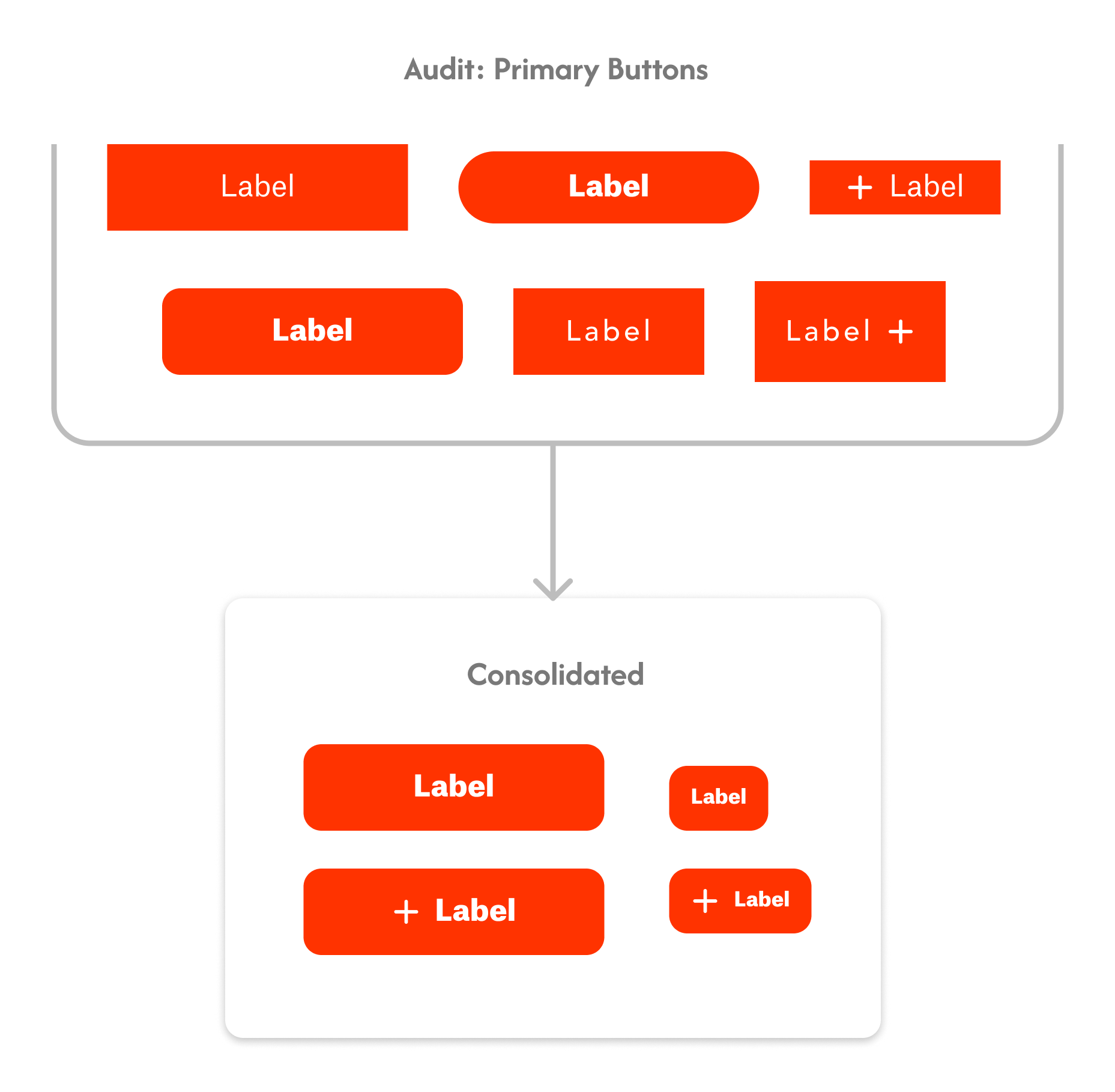
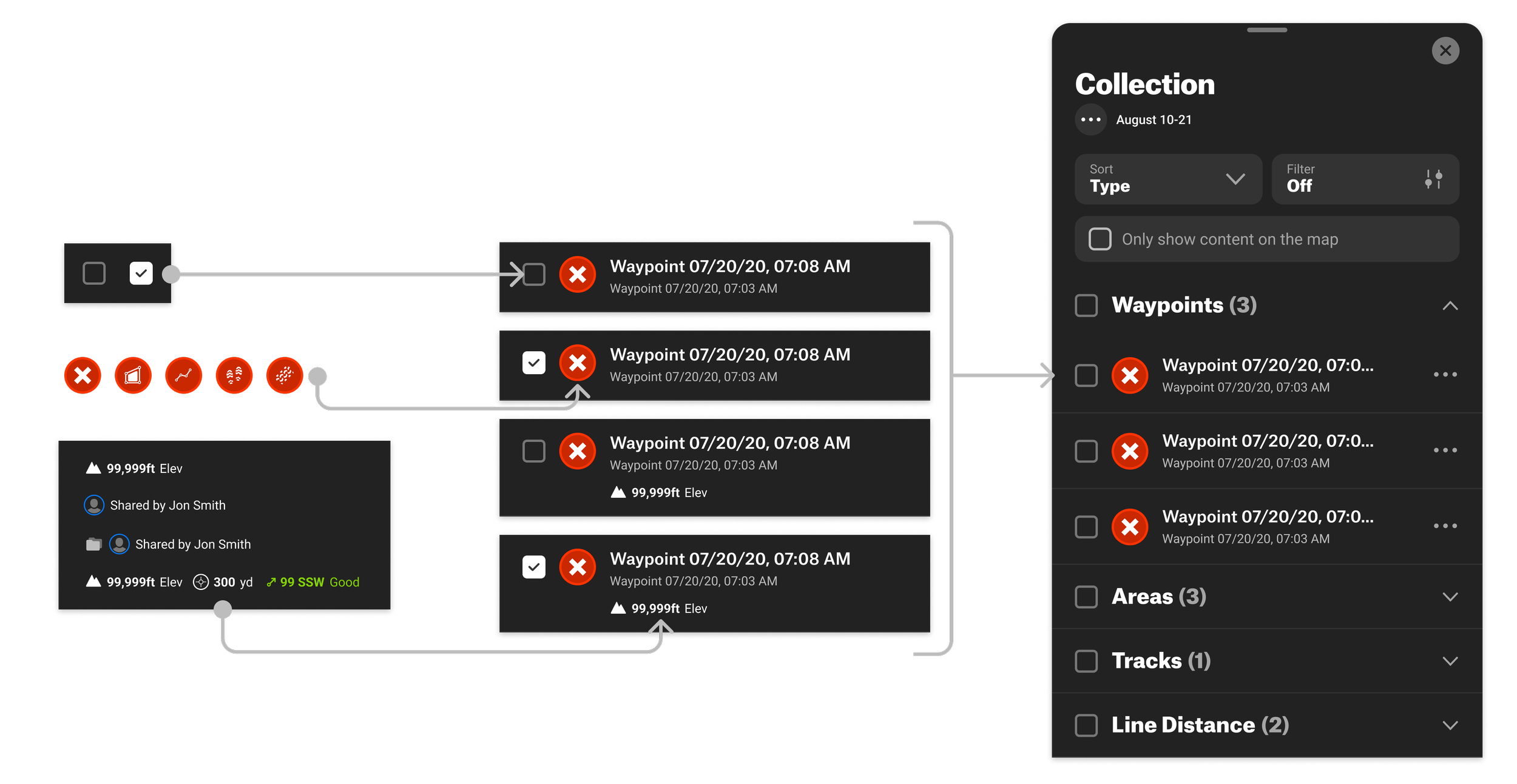
Component & Pattern Development
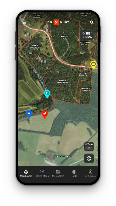
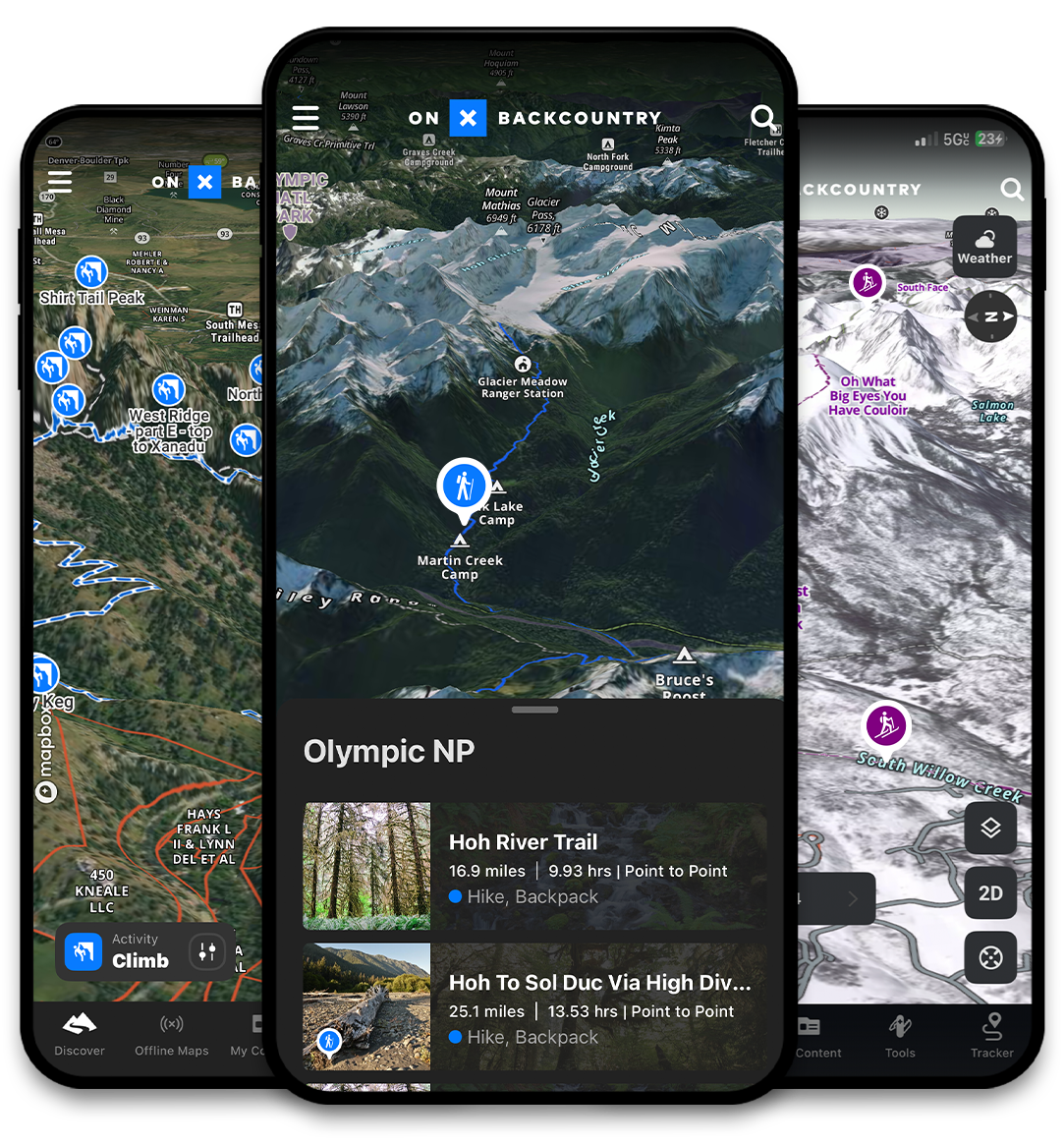
I systematically audited and standardized UI components, creating a comprehensive, reusable design system for buttons, widgets, list items, and map elements. Partnering with engineering, I resolved inconsistencies, developed missing components, and integrated them into Storybook for seamless adoption and continuous refinement.
Documenting, Educating & Driving Adoption
We developed comprehensive documentation covering design foundations, components, accessibility, and governance, along with contribution models and a changelog. Continuous training empowered designers to educate cross-functional teams, while role-specific sessions ensured easy access to resources. Despite organizational silos, we secured strong buy-in, increasing awareness and adoption.
Results
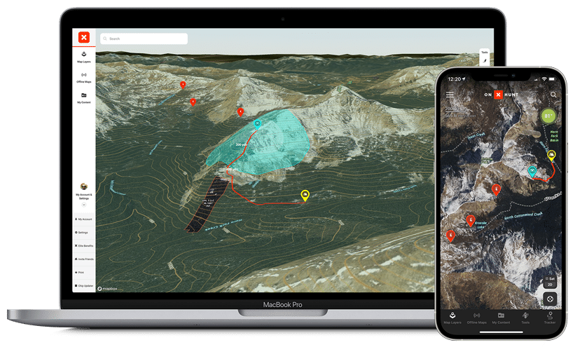
The design system has been pivotal in driving consistency across onX products, enabling designers to focus on solving complex outdoor mapping challenges while improving efficiency and cohesion.


-
Doubling Engagement by Unifying Prescient’s Experience
-
Driving Systems Adoption & Streamlining Production at FBN